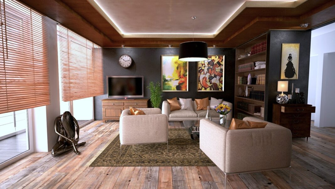
Principles of design define how the elements of design (color, texture, line, space and shape) should be used in order to achieve a functional and stylish living space i.e. to decorate your home.
These principles include balance, rhythm, unity, contrast and emphasis.
1) Balance
This refers to an even distribution of visual weight in a living space by ensuring different design elements are in appropriate proportions.
Balance is based on an imaginary or real focal point or visual axis and employs the symmetry of equal visual weight objects to achieve optical equilibrium. It can either be symmetrical, asymmetrical or radial.
Symmetrical balance is achieved by dividing a room in two equal parts divided by a central axis and making each side an exact mirror replica of the other.
Asymmetrical balance involves the use of odd numbers or different objects carrying the same visual weight or optic attraction to achieve equilibrium.
On the other hand, radial balance is achieved through the use of a central piece around which all other element seem to radiate.
What Does The Choice Of A Woman’s Lingerie Colour Convey About Her
2) Contrast
This refers to the effect of putting two or more opposing aspects of an element against each other to decorate your home. It can be achieved through the use of all elements of design used in home decoration.
A room with too much similarity and no contrast is usually boring and uneventful therefore a successful home designer should strike a balance between both.
Colour is the easiest element to use when trying to bring out contrast but texture and shape are also equally useful.
3) Unity
This principle is based on the notion that there should be a sense of harmony and uniformity among the elements of design used in a room enabling them to function together.
Also Read: So Many Advantages Of Outdoor Kitchen – Make You Fall For It.
All the furniture and accessories used in the space should complement each other ensuring a smooth transition to the eye from one object to the other.
This can be achieved through the use of similar shapes, common patterns, a colour scheme or a common background among others.
4) Rhythm
Rhythm is created by the repetition, alternation or progression of elements in an organised manner.
Repetition is where certain design elements or home accessories are used several times in an orderly fashion.
Alternation entails alternating two or more furnishings or design elements such as colour, texture line or shape in a predefined style.
In progression, items are arranged in ascending or descending order based on their distinctive characteristics such as size, shape or colour among others.
5) Emphasis
This is based upon centre pieces or focal points. The principle dictates that a living space should have an attention grabber which dominates all other furnishings and accessories pulling them together toward it.
Focal points could be a piece of furniture, a piece of art or a wall made prominent through the use of colour, light, texture, line or shape.
A contrasting texture or colour painted on an accent wall or overhead lights directed towards a specific point naturally draws attention to it thus creating emphasis on it.


It’s amazing in favor of me to have a website, which is beneficial for my know-how.
thanks admin
WOW just what I was searching for. Came here by searching for woolrich